|
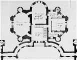
Starting from the Entrance Hall (South courtyard side) and working
clockwise, the rooms are labled (Fig 1 below) :-hall &
stairs 20 Sq.,Drawing-room 20 by 30, Dining Room 20 by 28, ladies
Dressing 8 by 11, Watercloset, Bedroom 16 Sq., Gentleman's Dress 11
by 6, Watercloset.
Connecting the wings to the main house and mirroring the curve of the
entrance loggia are single storey corridors on the North side of the
Courtyard, between which are the steps leading up to the entrance.
The separation of the domestic service accomodation from the main
house seems to have been unusual in Adam's designs for the smaller
country Houses. While for the owners there were advantages, this
arrangement presumably brought with it some problems, such as the
length of time it might have taken to get hot food from the kitchen
to the dining room.
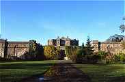
The design carefully contrives to deny a full view of the house from
the approach on this South side. The side wings and entrance
courtyard walls screen and shelter the house. The effect of this is
enhanced by the use of the Castle Style, which give the impression of
battlements and defenses around the house which is itself designed to
look like a castle keep.
The woods to the East and West sides also help to provide a screen to
the house.
By continually denying a view of the house the design skillfully sets
up an almost theatrical sense of anticipation. The house is only
gradually revealed as you approach and enter the entrance courtyard.
Even after you enter the front door you are not given any real sense
of the scale of the house, nor what the North side might look like.
|
Plan |
|
 |
Fig 1. The House. Detail of Plan at Principal
(Ground Floor) Level. On the South side is the entrance
courtyard. A single storey corridor leads from both the East wing and
West wing into the entrance hall of the main house. The corridors are
curved to mirror the curved loggia on the South side of the Entrance Courtyard. |
|
South Side |
|
 |
 |
 |
|
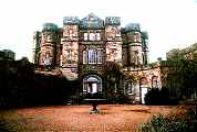
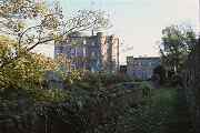
Fig 2 The South Approach. The side wings and the South wall to
the entrance courtyard between them screen the main house behind,
which is itself designed with the defensive features of a castle keep. |
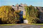
Fig 3. Entrance Court Gate
There are tantalising glimpses of the house as you approach. The
climbing plants, which clearly like the South facing wall, currently
hide the miniature square turrets that frame the gate on either side
and have blank recessed dummy window openings. |
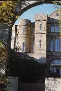
Fig 4. Entrance Court Gate
The gate frames the view of the South side of the house,
which, with its combination of Square and circular turrets could not
be more heavily and dramatically modelled to achieve a depth of
facade, that Adam defined as movement. |
|
 |
 |
 |
|
Fig 5 Upper S. Facade
The facade of the curved corridors that embrace and lead the eye to
the entrance, have an arcade of arches that mirror the arched opening
of the loggia on either side of the entrance gate, where this
photograph was taken from. |
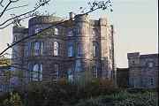
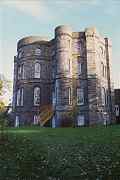
Fig 6 Upper S. Facade
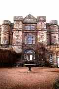
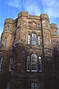
The House is designed to to look like a castle keep. The vertical
turrets, like great trumpet blasts, give it a great mass and solidity
and a vertical emphasis. The vertical elements are visually bound by
the horizontal string courses and battlements, like metal bands
around a casket. |
Fig 7 Upper S. Facade
There is a great contrast between these massive upper works and the
delicate stone detailing of the courtyard and the front door entrance
screen. Adam was always striving to give visual variety to his
facades. This is a supurb example what he defined as movement. |
|
 |
 |
 |
|
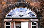
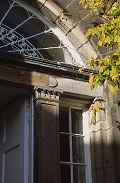
Fig 8 Front Door Fanlight and Entablature
The corinthian pilasters support a simple entablature above which is
the fanlight, within a flattened arch spanning the tripartite screen
below. The wall beyond the dressed stone voussoirs of the arch, is
formed of coursed rubble. Much of the stone in this building is in
need of repointing. |
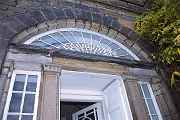
Fig 9 Front Door Fanlight
The corinthian pilasters support a simple entablature above which is
the fanlight, within a flattened arch spanning the tripartite screen
below. There is are double outer solid doors for security and a
single inner glazed door, with lobby between below the vault of the fanlight. |
Fig 8 Front Door Detail
The door has a casement window on either side. The tripartite
arrangement is divided by Corinthian pilasters with a delicate
Corinthian capital. The center stone of the entablature is beginning
to lose its face as a result of uneven weathering. |
|
|
|
|
Home |
History of Seton Castle |
Seton
Castle Exterior |
Seton
Castle Interior |
Glossary |
|
Links |
Bibliography |
|
Robert Adam's
Castle Style - Home Page |
|
Credits |
Multimedia
Catalogue |
Catalogue
Help |
|
Your Internet Browser must be set to read Java Applets
to view the catalogue |
|
keywords: Robert Adam,architect,architecture,Castle
Style,Seton, Castle,Country House,East Lothian,Scotland,Georgian
Architecture,C18,eighteenth,century,visionary
architecture,architectural visionary,visionary,Sandy
Kinghorn,Cadking,visual catalogue,catalogues,NOF,RSL,SCRAN |
|
Published by Cadking
Design Ltd, Edinburgh, Scotland - Copyright © Sandy Kinghorn
This project is part of the RLS (Resources for
Learning in Scotland) database held by SCRAN.
The full RLS database can be accessed on http://www.rls.org.uk |
|
Optimised for Internet Explorer 5 and 6 (or later) and
Netscape 4.5 (or later) |
|
|
