|
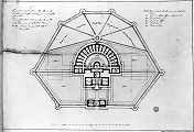
This design is really a re-working of the previous design, scheme 3,
after major reduction in accommodation, presumably as a result of a
cost cutting exercise. The plan shape of the perimeter walls is
identical, as is the internal arrangement of the central prison block
and Panopticon hemisphere. The maj changes are obvious. The side
wings and the link between them and the central block of the prison
have been omitted. This has reduced the number of courtyards. Fig 1
shows in outline the position these wings had occupied. In addition
the Governor's house is greatly reduced in size from the previous scheme.
|
 |
Fig 1 - Ground Floor and Courtyards. There are two ground
floor plans of this version of the Bridewell, one annotated and the
other not. Where the East and West wings were, only their outlines
are shown, and the arrangement of the courtyards has been altered to
provide gardens in place of the buildings. The size of the Governor's
house has been reduced by half, and split to provide an apartment for
both a Governor and Governess. |
|
 |
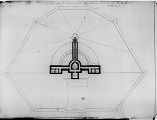
Fig 2 - Sub-Basement Link to the Exercise Yards. The plan
at this level shows three passages linking the stairwells (providing
access to and from the cell galleries) to the exercise yards to the
South of the building. The ground Floor plan above, only shows a
single stair emerging on the South side by the Observation lodge.
This is another indication that the design is still in flux. On the
East and West sides at this sub-basement levels there are cells for
solitary confinement.."blackholes". |
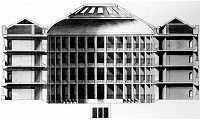
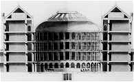
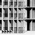
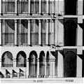
Another major change is obvious in the section (Fig 4) which it seems
reasonable to ascribe to this set of plans. By comparison the new
interior of the central cell block is stripped down, utilitarian and
devoid of decoration. Gone are the tiers of Doric columns. Gone is
the arcaded base tier of cells and the arched door openings where the
corridor breaks through the radiating walls.
From any perspective it seems extraordinary (and perhaps somewhat
endearing) that Adam was considering including some of these details.
Perhaps interest in the architecture subsumed all practicalities. One
can imagine the comments of the committee overseeing the project.
They may well have thought that any architectural effect would be
lost on those to be detained and that the revised design far more in
keeping with a prison.
Irrespective of the changes, the space itself, capped by the curving
ceiling and rooflights, would still have been dramatic.
|
 |
 |
|
Fig 3
Revised design of the interior of the hemicycle space, with little
or no decoration |
Fig 4
First Design of the half-cylinder space included an arcade of
arches and four tiers of Doric columns |
|
 |
 |
|
Fig 5
Detail of simplified interior |
Fig 6
Detail of original design for interior |
On the plan of this version of the Bridewell there is a particularly
interesting note inscribed around the perimeter of the walkway
external to main prison wall. This reads "A walk with Wooden
Pallisades with Centinel Boxes on the Angles for guarding the
outsides of the Walls, to prevent attacks from without or getting
over the walls from Within"
The political
situation in Scotland at this time is covered elsewhere in these
essays. Suffice to say here that this note gives us the clue that the
Bridewell was not just intended to act as a prison preventing people
inside from getting out. It was also designed to be defensible, to
actually be a fortress, as well as look like one.
|
 |
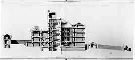
Fig 7 - North South Section. This section shows
parts of the building in accordance wiht the plan for this version of
the Bridewell, such as the reduced size of the Governor's house, and
parts that relate to the previous version, such as the treatment of
the Interior courtyard. |
|
 |
Fig 8 - Detail of North South Section.
"A walk with Wooden Pallisades with Centinel Boxes on the
Angles...". It surely must have amused Adam to be designing a
wooden pallisade in the style of an early Roman fort for the centre
of Edinburgh. |
|
 |
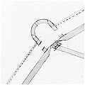
Fig 9 - Detail of Plan at Yard wall.
Version 4
"A walk with Wooden Pallisades with
Centinel Boxes on the Angles..." This plan arrangement clearly
goes with the elevation in Fig 8. |
|
 |
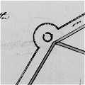
Fig 8. Detail of Plan at Yard wall.
Version 3. Included for comparison, this is the same
detail from the previous design, Version 3, where an enclosed
"Centinel box" taking up the entire corner is proposed.
This "room" would have been roofed over to keep the sentry
in darkness, allowing him to observe but not be observed. There are
invisible inspection slots on both the external wall and the main
wall to the prison yards. In this way a sentry would be able to guard
against external attack, and supervise the prison yards, while
remaining invisible in the darkened interior of their "centinel box" |
|
 |
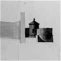
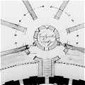
Fig 9. Detail of Observation Lodge. Very similar to
the previous scheme, all the exercise yards for the different
"classes" of prisoners could be invisibly supervised from
one central position. |
Click BACK to select the next essay. |
|
|
|
BACK |
|
Home |
Prison
in late 18th Century
Scotland |
Robert
Adam's Designs for the Bridewell |
Scottish
Politics and the Bridewell Designs |
Glossary |
|
Links |
Bibliography |
|
Credits |
Multimedia
Catalogue |
Catalogue
Help |
|
Your Internet Browser must be set to read Java
Applets to view the catalogue |
|
keywords: Robert Adam,architect,architecture,Castle
style,Bridewell,Calton,gaol,jail,prison,Edinburgh,Scotland,Georgian
Architecture,C18,eighteenth,century,visionary
architecture,architectural visionary,visionary,Sandy
Kinghorn,Cadking,visual catalogue,catalogues,RSL,SCRAN |
|
Published by Cadking
Design Ltd, Edinburgh, Scotland - Copyright © Sandy Kinghorn
This project is part of the RLS (Resources for
Learning in Scotland) database held by SCRAN.
The full RLS database can be accessed on http://www.rls.org.uk |
|
Optimised for Internet Explorer 5 and 6 (or later) and
Netscape 4.5 (or later) |
|
|
